Laying the Foundation for Mobile-First UX
Establishing Responsive & Mobile Design at John Deere


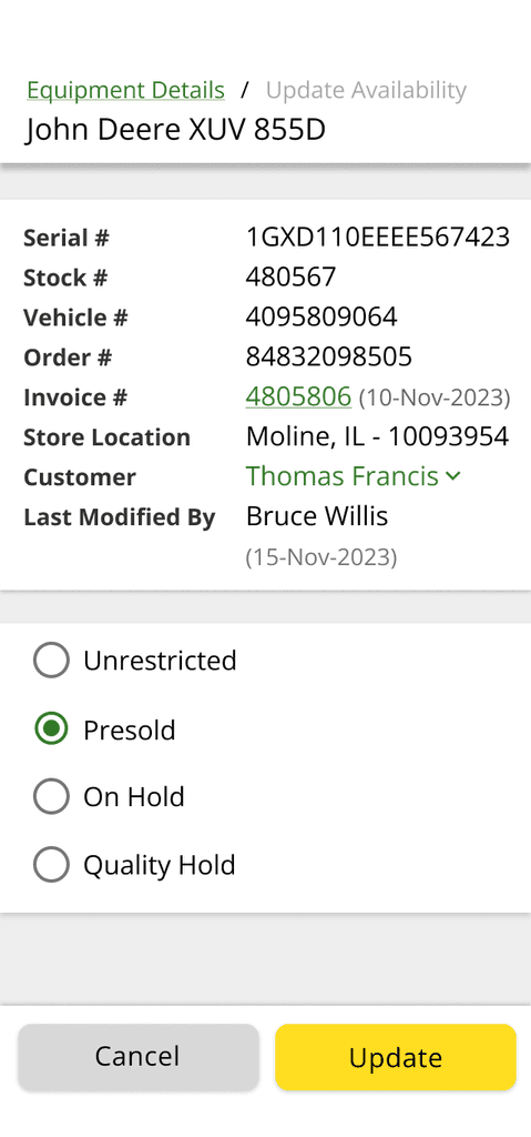
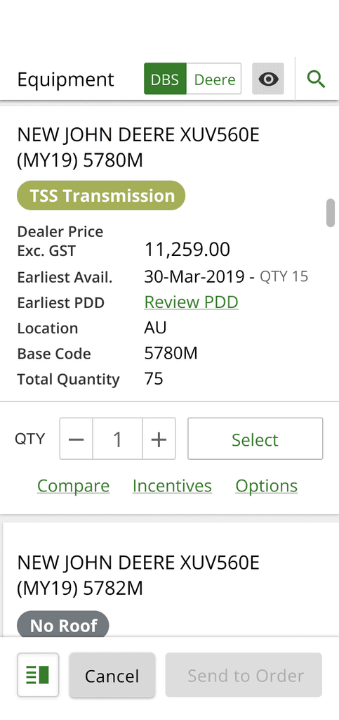
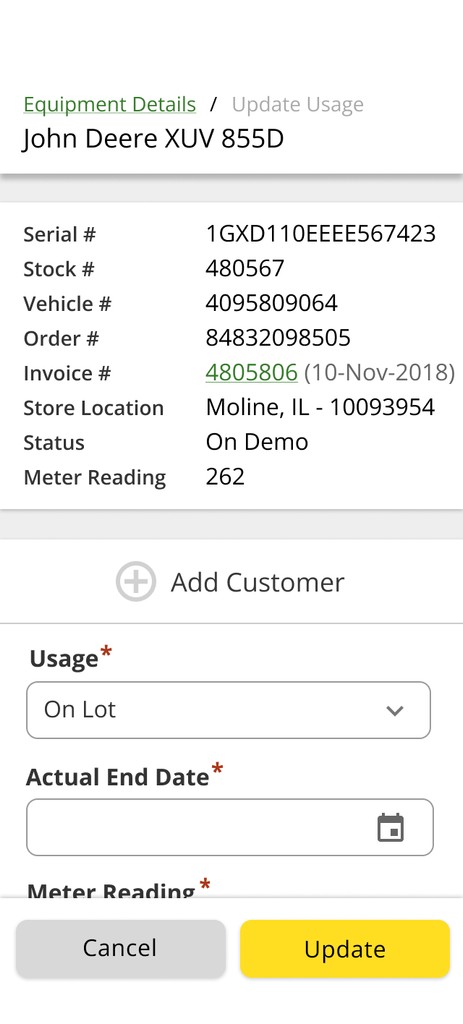
When John Deere Order Management began transitioning to mobile-first design, we faced significant challenges: inconsistent practices across teams, inefficient workflows, and resistance to prioritizing mobile work. As a UX Designer, I led efforts to create scalable design systems, reusable components, and actionable solutions that not only addressed these issues but also doubled developer efficiency and laid the groundwork for future responsive projects.
In order to scale our organization to responsive design, myself and the lead designer set up a Responsive 101 presentation. We decided that CSS Grid would give us the control we desired - It gave us the ability to move elements from one form factor to another so we'd have complete layout control.
Some Responsive 101 I created and co-presented;
Self-Learning and Mastering Tools
To approach responsive design effectively, I dove into CSS Grid, Flexbox, and Figma’s advanced features like Auto Layout and Fill Container. This foundation enabled me to create responsive designs that worked seamlessly across devices.
Collaborating with Mentors and UX Advocates
I worked closely with Design and Software Engineering mentors and drew inspiration from experts like Jen Simmons (CSS Grid). Their guidance helped me align on web standards, responsive strategies, and Atomic Design principles, shaping my approach to creating scalable, user-centered solutions. UX Advocates were engineers on each product team that would be developing the UI.
Developing and Presenting Guidelines
I established responsive design guidelines that included concepts like Fraction (FR) units, Grid-Template-Areas, and reusable Figma components. These guidelines empowered product teams to adopt consistent, dynamic layouts that adapted effortlessly to any screen size.
Advocating for Mobile Work
One of the biggest challenges was securing leadership and team buy-in for mobile-first design. By presenting prototypes and demonstrating their impact during two usability studies at John Deere’s annual dealer conference, we gained the support needed to prioritize responsive design across multiple projects. Early 2024, I facilitated the creation of the mobile design guidelines which were then passed up from my org to the Global UX team for all of John Deere to consume.
A FigJam file illustrating my facilitation of the Mobile Design Guideline planning process.
Consistent Design Strategy
Established responsive design guidelines and reusable components, enabling a unified approach across teams. Leveraging CSS Variables allowed sweeping updates across the application, streamlining workflows and ensuring consistency.
Improved Responsiveness
Designed flexible, scalable interfaces using Figma’s Auto Layout and CSS Grid. Implemented container queries in components and templates, ensuring dynamic, content-driven layouts that enhanced usability and efficiency.
Enhanced Developer Efficiency
The components and templates I created doubled developer productivity for front-end and responsive development. These pre-solved patterns minimized rework and accelerated delivery timelines.
Mobile-Focused Future
Built adaptable, mobile-first designs that transformed desktop-centric layouts into responsive solutions. These efforts didn’t just address immediate project needs—they set the foundation for future scalable and user-friendly systems.


